iOS Fragmentation: Welcome to iPhone 6 and Plus
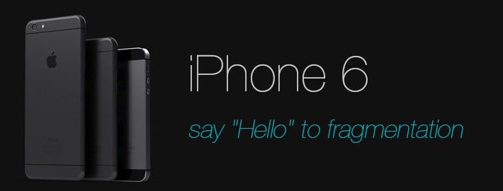
or just say “Hello” to fragmentation issues on iOS with iPhone 6 and iPhone 6 Plus!
You have fragmentation problem and Do you know that?
Not much, just 2 years ago during these days; iOS developers just had one screen size to take care of. There is no fragmentation problems, there is no OS differences, nothing to care about like Android developers!
However, everything is changed completely for iOS developers now!
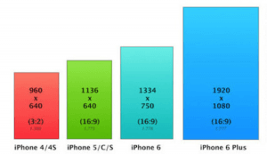
With point system, designing your app for 3:2 aspect ratio and providing normal (iPhone 3GS) and retina (iPhone 4/4S) image resources was enough for a solid application design. In 2012, when iPhone 5 was introduced with it’s 640×1136 pixels screen, things were starting to chance for Apple too.
When it starts?
Actually, iPhone 5 transition wasn’t a big deal for developers. You just had to fill the extra 176 vertical pixels. Previous images were fitting very well to new device. This continued with iPhone 5s too. Screen size and pixel count stayed same with 5 model, and thus pixel density was same again (326 ppi). Besides, Android developers were trying to handle thousands of distinct device resolutions using layout systems and different image directories (dpi, mdpi, hdpi, xhdpi, xxhdpi, xxxhdpi). [1]
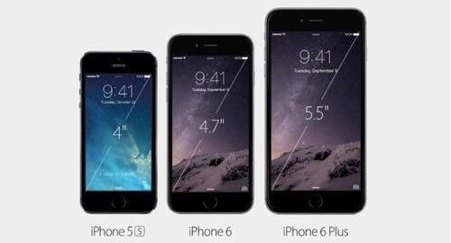
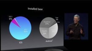
But last week, Apple announced two new iPhones with bigger screens: iPhone 6 and iPhone 6 Plus. This time again, they sticked to the plan and keep the screen pixel ratios at 16:9. Noting that, 91% of users have iOS 7 now; we can opt out the devices that won’t be able to switch to iOS 8 will be obsolete soon.
Download Smartface App Studio and iOS emulator on Windows PC!
So iPhone 4s is an outsider with it’s 3:2 screen. Finally we have iPhone fragmentation here with 4 devices. Just 4 devices might not seem a real one; but considering the usage and adoption of iPhone devices around the world, we need to think again!
Here we have 3 screen categories with 326 ppi and one iPhone 6 Plus with 401 ppi. All (except 4s) have 16:9 screen ratios. It won’t be much problem for developers to support every one of them at the same time. If iPhone 6 had bigger screen than this, images will start to seem blurry even the ratio stayed same. But 0.7 inches of increase is not a case. On the other hand, the phablet actor of the latest announcement changes it lot. It has 401 ppi and 5.5 inch screen size. Here we have more density and significantly bigger screen than current device adoption.
iPhone 6 Plus has 5.5 inch screen with 401 ppi!
So, Apple will start to encourage using Image Asset Catalogs [2] and size classes introduced with Xcode before. Also auto layout feature won’t be enough itself, because when density and size fragmentation increase, you will need to prepare different images and fit your fonts to screen more attentive. @2x images were the salvation for retina displays, now @3x is on the way for iPhone 6 Plus. Let me remind you another thing: Apple Watch. Do you think it’s screen will fit in categories above?
Apple Watch is completely out of category and you’ve never ready something like that before!
The good part of all these complexity, we have better devices with bigger screens and powerful processors. Why you’re taking care that much and sometimes even not get a right solution with screen fragmentation, instead of bringing your creative native app ideas into action?
Smartface App Studio is a solution for iOS Fragmentation Problem
Smartface App Studio is handling Android fragmentation (please see the picture above again) for you since years. Just check how it’s possible with Smartface App Studio? Fragmentation is the stage of us, you can just perform your “application development” show.
[1] : http://opensignal.com/reports/fragmentation.php
[2] : https://developer.apple.com/library/ios/recipes/xcode_help-image_catalog-1.0/Recipe.html


